Introduction
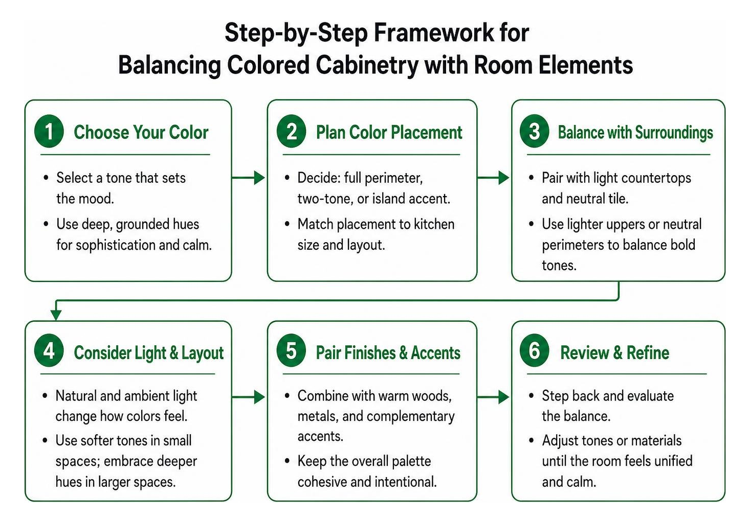
Colored kitchen cabinets succeed when you pair a grounded shade with a clear placement strategy. Leading choices for 2026 include earthy sage, oceanic teal, rich navy, dramatic charcoal, and expressive plum. Use full-perimeter color for a bold, cohesive look, a two-tone split to make ceilings feel taller, or an island-only accent to anchor an open floor plan without overwhelming the room. Once the color and placement are set, balance the cabinetry with warm brass or matte black hardware and light, softly veined countertops.
The all-white kitchen had a great run, but homeowners everywhere are ready for personality, warmth, and depth. Stepping away from stark neutrals allows you to turn the busiest room in your home into an expressive, inviting showpiece. Today’s design movements celebrate individuality, drawing inspiration from natural landscapes, heritage architectural palettes, and rich jewel tones.
Color psychology plays a quiet but powerful role in the way a kitchen feels day to day. Cool greens and blues tend to slow the pace and promote calm, while deeper charcoal and plum tones add a sense of drama and intimacy to gatherings. Understanding the way a hue interacts with natural light, room size, and surrounding finishes helps you choose a shade that supports the mood you want your kitchen to carry, not just a color that looks appealing in isolation.
Whether you are updating an existing layout or planning an entire remodel from scratch, exploring colorful cabinetry opens up exciting design avenues. Beautiful color choices breathe fresh energy into your daily routine while adding lasting charm that withstands passing fads.
Inspiring Shades for Colored Kitchen Cabinets in 2026
Designers and homeowners are embracing nuanced, mood-rich palettes. Leading trend forecasts, including the 6 cabinet colors design pros say will be huge in 2026, show a decisive move toward earthy, organic hues and deep statement shades that ground a room with elegance. Combining distinct finishes like our Oxford Toffee and Oxford Sage cabinets provides an ideal balance between classic woodwork and fresh color.

Nature Greens and Earthy Sage
Soft greens, muted olive, and eucalyptus tones create a serene, grounded atmosphere. These shades act almost as organic neutrals, pairing seamlessly with natural timber elements, tumbled stone, and polished surfaces. When crafting a timeless environment, choosing flawless cabinet door lumber ensures the underlying structure matches the beauty of your chosen hue. Earthy sage softens bright natural daylight, making the kitchen feel like a peaceful retreat. Furthermore, muted botanical greens harmonize effortlessly with brushed metal fixtures and light oak flooring, establishing a relaxing connection to the outdoors that remains fresh through every season.
Oceanic Teal and Rich Navy
For those seeking depth without straying into pure darkness, oceanic tones provide a magnificent solution. Deep jewel teals, smoky jades, and maritime blues evoke tailored sophistication. Selecting grounded, complex teals rather than bright tropical blues ensures the room retains a high-end feel. Following proven teal cabinetry design tips helps balance these bold tones against surrounding architectural elements so the overall room feels unified and calm. Navy and dark teal also present a striking backdrop for polished brass fixtures, turning functional cooking zones into refined focal points.
Dramatic Charcoal and Expressive Plum
When maximum contrast and drama are desired, rich plum, midnight charcoal, and dark espresso step into the spotlight. A deep charcoal finish can transform standard layouts into architectural masterpieces, as seen in this kitchen charcoal cabinets project. Deep tones make wonderful anchors for kitchen perimeters or dedicated beverage centers, especially when complemented by warm wood tones such as espresso kitchen cabinets. Plum introduces an unexpected, bespoke warmth that pairs gracefully with honed marble and antiqued brass accents, giving kitchen cabinetry an artisanal, custom-crafted allure.
Strategic Placement: All-Over, Two-Tone, and Island Accents
Choosing a color is only the first step; deciding where to place that color dictates the entire visual flow of the room.

| Strategy | Visual Impact | Best Kitchen Types | Styling Tip |
|---|---|---|---|
| Full Perimeter Color | Bold, cohesive, immersion | Medium to large open plans | Pair with light countertops and neutral tile to balance saturation |
| Two-Tone Split | Taller ceiling illusion, balanced | Small to mid-size kitchens | Place darker shades on bottom, lighter tones on uppers |
| Island-Only Accent | Focused anchor, low commitment | Open-concept kitchens with central island | Keep perimeter neutral to let the center piece shine |
The Two-Tone Elevation
A split-color layout uses physics and visual perception to your advantage. Darker tones anchor the lower section, while lighter, softer tones on upper cabinets draw the eyes upward, making ceilings appear taller. Real-world examples, such as these two-tone cabinet transformations, demonstrate that pairing muted complementary shades creates a bespoke aesthetic that holds up through years of daily cooking. This visual division introduces dynamic architectural interest, preventing heavier saturated hues from dominating the upper sightlines of the room.
Island-Only Statement Pieces
If you want a splash of rich tone without wrapping every wall in color, the kitchen island serves as the perfect canvas. Painting or ordering a dedicated island in deep navy, forest green, or plum anchors an open floor plan. You can keep surrounding perimeter storage clean and crisp with modern white shaker cabinets, creating a timeless pairing that feels intentional and balanced. An accent island draws people into the center of the kitchen, creating an inviting hub for culinary preparation, casual dining, and lively conversation.
Designing Around Your Layout and Accents
Layout dimensions and lighting determine the behavior of vibrant shades throughout the day. Morning sun highlights warm undertones, while evening ambient lighting deepens saturated tones.
Small vs Large Layouts for Colored Kitchen Cabinets
In compact spaces, dark tones across every surface might overpower ambient light. Instead, use soft greens, misty blues, or sleek European kitchen cabinets with flat-panel profiles that reflect light cleanly. In larger spaces with high ceilings, wrapping the entire room in deep hues creates an intimate, sophisticated atmosphere reminiscent of high-end historic residences. Thoughtfully placed recessed lighting, pendant fixtures, and under-cabinet LED runs illuminate saturated colors, keeping every corner bright and visually appealing regardless of room dimensions.
It also helps to consider the movement of natural traffic flow through the kitchen. Open-concept layouts that connect to a living or dining area often benefit from a slightly lighter palette near sightlines to adjoining rooms, while enclosed galley kitchens can embrace richer, more saturated tones since the space already feels contained and cozy. Matching your color intensity to the architectural bones of the room keeps the final result feeling intentional rather than accidental.
Pairing Finishes with Colored Kitchen Cabinets
Hardware and surfaces act as the jewelry of the kitchen. Warm brushed brass and antique bronze add radiant contrast against navy, teal, and forest green. Matte black handles provide a crisp, modern edge to sage and plum cabinetry.
For surfaces, bright quartz with subtle gold or gray veining prevents deep cabinet colors from feeling heavy. Modern materials like high-gloss or matte acrylic cabinet doors can also be used on accent runs to introduce textural variety and light play. Selecting cohesive textures across backsplashes, counter stools, and open shelving creates a unified composition that highlights your chosen cabinetry shade.
Long-Lasting Finishes: Professional Quality and Longevity
A colorful cabinet installation is only as good as its durability. Kitchens face heat, steam, and constant handling, which means surface protection is essential.
- Thorough Degreasing: Removing cooking oils and residues ensures primer adheres smoothly.
- Surface Abrasion: Sanding surfaces with fine-grit abrasives creates mechanical adhesion.
- Bonding Primers: Shellac or high-grade bonding primers seal existing finishes and prevent stains.
- Multiple Thin Coats: Applying several thin layers of cabinet-grade enamel prevents drips and runs.
- Complete Curing: Allowing the finish to cure fully over several days builds an ultra-resilient shell capable of resisting chips and scuffs for years.
Selecting high-grade factory finishes or professional polyurethane coatings guarantees that bold colors resist fading under direct sunlight. Premium finishes provide a moisture-resistant barrier against daily kitchen activities, ensuring that vibrant doors and drawer fronts retain their lustrous, showroom-quality appearance for decades.
When evaluating cabinet doors for a renovation, it is worth comparing the way different manufacturers prepare and finish their products before they ever reach your kitchen. Factory-applied conversion varnishes and catalyzed finishes tend to outperform site-applied paint in both durability and consistency, since they cure under controlled conditions rather than relying on ambient humidity and temperature. Asking about the finishing process upfront helps ensure your chosen color will look as vivid in ten years as it does on installation day.
Frequently Asked Questions
Will dark cabinet tones make small spaces feel cramped?
Dark tones do not automatically shrink a room when balanced with intentional lighting. Pairing deep base cabinetry with light-reflecting countertops, under-cabinet LED strips, and lighter wall paint maintains an open, airy feeling while adding richness.
Which countertop surfaces pair best with bold cabinetry?
Engineered white quartz, Calacatta-style surfaces with soft veining, honed soapstone, and warm butcher surfaces harmonize beautifully with bold cabinets. Keeping countertops understated allows your chosen cabinet shade to remain the main attraction.
Which hardware metal complements blue and green cabinetry?
Warm brass, satin bronze, and champagne gold offer a striking, classic pairing against blue and green tones. For a more transitional or industrial look, matte black and brushed nickel provide clean, understated accents.
Conclusion
Stepping away from neutral palettes lets you craft a space full of joy, warmth, and enduring personality. Whether you choose serene sage, dramatic navy, or a creative two-tone combination, your kitchen can become a unique reflection of your taste. At K&B Direct, our mission is to provide premium kitchen cabinets paired with attentive guidance to help you bring your dream home aesthetic to life with confidence and ease.